Finally! A productive week and a great way to start February. (Already?? How the heck did that happen??) Inspired and encouraged by your responses to my pages in the Travelling Sketchbook last week, I decided to get my act together and work on the Christmas paintings I started in December. This is a foursome that will eventually hang together in a grid - at least that's the plan...
I think I have finished the Nutcracker. I need some advice though...

Nutcracker - finished??
I am uncertain about the background for these. Last time someone suggested underpainting it red and green. I think that helped. Then I thought copper might be nice...

then I didn't...
This painting (below - my favourite by my now-deceased sister) will come down and the four paintings will hang here over the holiday season. (I decorate with paintings too - is that weird?)

The wall is a creamy colour with a hint of yellow and I want to co-ordinate with that.

Clara - WIP
Clara is the second in the series and for Clara I also need some help. Again, I'm unsure about the background, and I know I need another coat of paint on the nutcracker... but what about her hair? I think of her as blonde but might black hair be more effective? What do you think?

Clara - WIP - with her model nutcracker... (against that wall)
I also did a bit of work on the remaining two paintings:

Mouse King - WIP
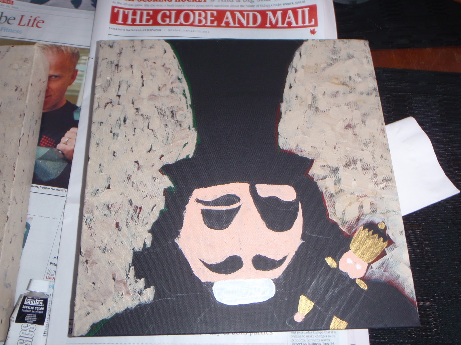
Herr/Professor Drosselmeyer - WIP
Any recommendations are appreciated!
I also started Ayala Art's new challenge for February - 29 Faces. Great inspiration - especially if you are like me and want to practice "portraiture".. (Doesn't it sound fancy saying it that way!) Here is #3...

(Charles Darwin)
Want to join in?
Hope you have a great time at Paint Party Friday or creating Faces in February!
First Love Charles Darwin, I haven't posted Number 3 yet (whoops)... he he... OK I reaaaaalllly like the copper background & no I don't think it's weird to decorate with paintings & your sister 's painting is utterly gorgeous, beautiful work! Also I like the blonde hair I don't think I'd go black, maybe the darkest strawberry blonde with blonde highlights I just think black may overpower & BTW love what your working on!
ReplyDeleteYou've been very productive this week! Nice work!
ReplyDeleteWow, you have been very busy Eva. I love Charles Darwin. I love everything you are working on especially your Nutcracker. Your nutcracker looks finished to me. Awesome work. Well Clara has blue eyes so perhaps the blonde just a little bit blonder would go well. I like your Mouse King wip. You are a busy gal. Great job on all. Happy PPF!
ReplyDeleteWhat a clever idea to decorate with paintings! Your nutcracker series will be fabulous.
ReplyDeleteI think a lighter background would work, but not sure of the color (big help!). And I like Clara's hair lighter colored. Black would be too much, I think.
I can't wait to see how this series develops.
Eva, you have been painting up a storm! I love your Nutcracker theme! How about turquoise for the girl?
ReplyDeleteI clicked too fast lol I forgot to say, great face for the challenge!
ReplyDeleteok...one...not wierd...i put up stitcheries and paintings i have done that are christmassy too...and about your background...i am not sure but i am a lover of red and green and gold for christmas...so what about maroon and dark green with snippets of gold leaf??? and your drawing is ewonderful...oh and I love black or dark brown on girls, i find whenever i try to do blondes they look yellowy...oh well..i am a learner...lol...have a good weekend...wow...long comments...xxx
ReplyDeleteWow! You've been up to lots of paintings!! They are all beautiful! Keep on the "scientist" series!!! :)
ReplyDeleteYou've been so busy!! I quite like the backgrounds as they are - they remind me a little of the pointy backgrounds I do so I may be biased! I think Clara should stay blonde - maybe a few lighter and darker shades to give it depth but I think black would be too much for this painting.
ReplyDeleteOh, I meant to say - your sister's painting is beautiful - I can see why it is your favourite, such a gorgeous calming scene.
ReplyDeleteWow, what a creative week! I think blonde is nice on Clara, maybe a little darker? And the nutcracker is a lot better with the copper background.
ReplyDeleteoooh you have been so productive Eva, loving your nutcracker and the WIP's. Happy PPF, Annette x
ReplyDeletePS. Cannot give advice as am only a beginner, sorry.
Busy lady ~ Wow! Nutcracker is great and do think either background looks good from here ~ Other creations are wonderful ~ Your sketch is awesome ~ namaste,carol (Share the Creative Journey) Happy PPF ~
ReplyDeleteYou have my sympathies with your background woes- that's usually my LEAST favorite part in designing my paintings and many, MANY of mine have numerous layers of background! I LOVE the way the nutcracker turned out and I think Clara is off to a wonderful start! I like her hair, but what if you made her brows a tiny bit darker? Also, for the background, you might want to use the same background color for all 4 to unify them...I don't know, just throwing out ideas! I decorate with seasonal paintings too, BTW, so I don't think it's weird at all!
ReplyDeletewow Eva, you are quite the busy lady! Love these!! And your sister's painting is amazing! Love beach scenes!
ReplyDeleteHappy PPF!
Wow, you're so productive! I also find it often so difficult to decide when a painting is finished. Sometimes, you just have to leave for a while until you know what to do. The copper background looks fine though.
ReplyDeleteI want to practise "portraiture" (it realy is a great word) too, but I know I wouldn't manage to do one every day. It's sounds like a great challenge though.
Eva,
ReplyDeleteYou have been super-prolific this week! How inspiring!
Love the beginnings of the Herr/Professor already!
Very inspiring to see so much wonderful work!
♥♥♥
Happy PPF!!
Mary
Mixed-Media Map Art
loving the Drosselmeyer WIP (I lean to the dark side, LOL). Sadly I have no words of wisdom on your backgrounds, but I love the idea for this series and think they will look so cool together. For me the fun part about changing my wall art during the holidays is that it makes me appreciate my favorite "year round" art all the more when I hang it back up.
ReplyDeleteGlad you had such a productive week.
ReplyDeleteHmmm, maybe you could stamp or paint some holiday symbols into the background using watered down metallics. What about music notes? They would only show when the light hit them from certain directions.
I think Clara should stay blonde, but she needs a few darker strands in her hair.
Your sister's painting is gorgeous, those little waves and the distant shore and trees are lovely.
ReplyDeleteThe copper background looks great. Someone else said maybe give some darker tones and highlights to the blonde hair, that sounds nice, whatever you think looks good will work.
You've made so much and the wips are fun. Darwin in portraiture, awesome!
Not strange at all to use paintings as christmas decor. I do it all the time.
ReplyDeleteLove the nutcracker.
Love the WIP peeks! And I'm doing the faces too. Loving PPF!!!
ReplyDeleteRinda
How cute?! :) I'm looking forward to seeing the professor finished. :)
ReplyDeleteI like copper a lot ! I also like gold and silver...how about checkerboard in translucent pastels like a blue and green and purple or golden yellow real faint color but checked and flow-y ..
ReplyDelete-KAT-
I like the copper color for the background. It seems to coordinate the bright colors and your creamy yellowish wall. Also I wanted to say I think you have quite a talent at portraiture.
ReplyDeleteIt's inspiring to see how productive you've been this week! That's wonderful. I like to use complementary color schemes, or warm-cool combinations. Since you have a red subject, I'd bring in subtle greens maybe mixed with umber in the background. Just a thought. Nothing very bright or intense, though. It looks like you have a lot of great suggestions here. Good luck!!
ReplyDeleteI LOVE knowing somebody else who has been so inspired by the Nutcracker!!!! For years and years Tchaikovsky's music & ballet just let me fly into imagination.
ReplyDeleteThe copper looks real good, but green is always an excellent option - especially if you're not afraid of it looking too 'christmassy' which is what often happens when you put red and green together.
I actually like the background on Drosselmeyer a lot but re Clara - I'd say ANY background would improve on what's already there. A darker bacground will allow you to keep the blonde hair
Wonderful...your pieces are gorgeous and enchanting..awesome work! i always smile coming here..magical! and wow..your sister's art is magnificent! The painting is powerful..it feels like one is about to embark on a journey! beautiful!
ReplyDeleteVictoria
I am so impressed by how much you have done. I really like the copper background and I think blonde is a great color for Clara.
ReplyDeleteYou have inspired me to work a little more this week.
I like the background on the Nutcracker. Do the paintings need to match backgrounds? Maybe a little of the colors in each?
ReplyDeleteCatherine Denton
Great job! Love the nutcrackers and your sister's painting is lovely. I decorate with paintings too.
ReplyDeletexox
Hi Eva! Happy PPF! I love the Nutcracker Ballet... nice work! Thank you for your nice comment on my blog...
ReplyDeletehappy painting!
Renee
xoxo
I have to say Eva, I really like the copper background on the nutcracker. I like the blonde hair on Clara, maybe you could add more depth with some hi lights and low lights. Your sisters painting is really great.
ReplyDeleteI'm so impressed Eva with your improvement since I've started following your blog. It's so fun to be creative isn't it?
xx Jaime
OmG you are so busy. Great pieces all of them. I too have art from my sister who passed in 09. Hugs
ReplyDeleteNicole/Beadwright
All of your paintings are so inspiring. I like the copper background, but maybe it looks different in real life/light? As for decorating with paintings, when you paint them yourself and start accumulating, you have to do something with them! I like your Darwin, too. There's just something about rough pencil and pen portrait sketches.
ReplyDeleteAll of the works of art here are great. Fun Fun.. I can see you had great fun.
ReplyDeleteIf the blonde girl was mine, I would take a fan brush.. and dip it in darker color blonde with a few touches of lt. brwn.
Background I would do with a variety of warm colors in the hues of oranges with other textures.
That is just my "LITTLE IN PUT"!
I guess there is NO wrong and NO right.. just whatever you like.
Enjoy your process.. please let me know when you finish!
Thank you. hugs Darlene xo
Wow, you have been seriously busy, well done! Valerie
ReplyDeleteMan, that Nutcracker background is stunning! Really grabs attention (Although everyone else is saying that too). 'Portraiture' defiantly sounds fancy! And nice choice for a face!
ReplyDeletegreat work, Eva. You have been busy and every work is worth it. For the nutcracker man I think the background would look great in splashes of different greens. For Clara I agree that black hair is better to bring her out. Charles Darwin portrait is pretty awesome. :)
ReplyDeleteI think this is such a neat idea - and I love the nutcracker. I'm not one for advice, and I'm sure others are much more capable. But I love the idea you are working on. I think I will have to check out the 29 faces you mentioned. Cool idea. I'm not very good at it and I could sure use the practice.
ReplyDeleteBlessings,
Tricia
Nutcrackers looking great! I love your latest! Can't wait to see what he looks like when finished!!
ReplyDeleteOh, I love your Charles Darwin! Great job!
ReplyDeleteWoweeeee gazoweeee, you sure have been busy!!!Everything is coming out wonderfully! I especially love the Darwin!!!
ReplyDeleteFor Christmas, blending wouldn't be important. . . the blonde is perfect, perhaps a few curls here and there. Love Darwin, wow. Blessings, Janet PPF
ReplyDeleteHi Eva! You too are on a creative frenzy! Herr Professor is looking great and Clara, hmm, I've always thought of her as blonde! Patsy from
ReplyDeleteHeARTworks
This is really a huge project! I wouldn't try to match the wall color for the background. Any color will work with the cream walls. For these, I'd probably try a very soft pale blue, like cerulean with mixed with some white. Make it pale so that the figures themselves stand out and get the attention, not the background.
ReplyDeleteClara just needs a little shading in her hair. Raw sienna works well for blonde and then mix a lighter color of the yellow for a few highlights. That should tone down the yellow a bit. And don't forget to add some of the darker color to her eyebrows.
Wow! I'm so inspired with all of the work you've been doing. They look wonderful! I would definitely keep her hair blonde. And your Darwin portrait is awesome!
ReplyDeletegreat work, they look finished to me!
ReplyDeleteYou are way busy Eva! Good for you that you are getting your Christmas painting going early. These are so cute!!! Happy PPF!
ReplyDeleteIf you're not happy with your paintings...you could try to get a clear sheet of acetate and add color or elements to it and then if you don't like it...you haven't altered your original. Either way...they're wonderful as is!
ReplyDeleteLove the new copper background. Lots of times using a compliment to the colors in your painting for your backgound will make it pop.
ReplyDelete